Thursday, June 15, 2017

Describe


I used the plastic knife and the tape as my object, and also I made the plastic knife to cut the tape. But, in the real life, the tape won't be cut by the plastic.

Final Project-lotus


Friday, June 9, 2017

Final Question

1. My final project is about  "protect our environment." Nature give us many things, which are beautiful and useful,we need to treat our environment well.

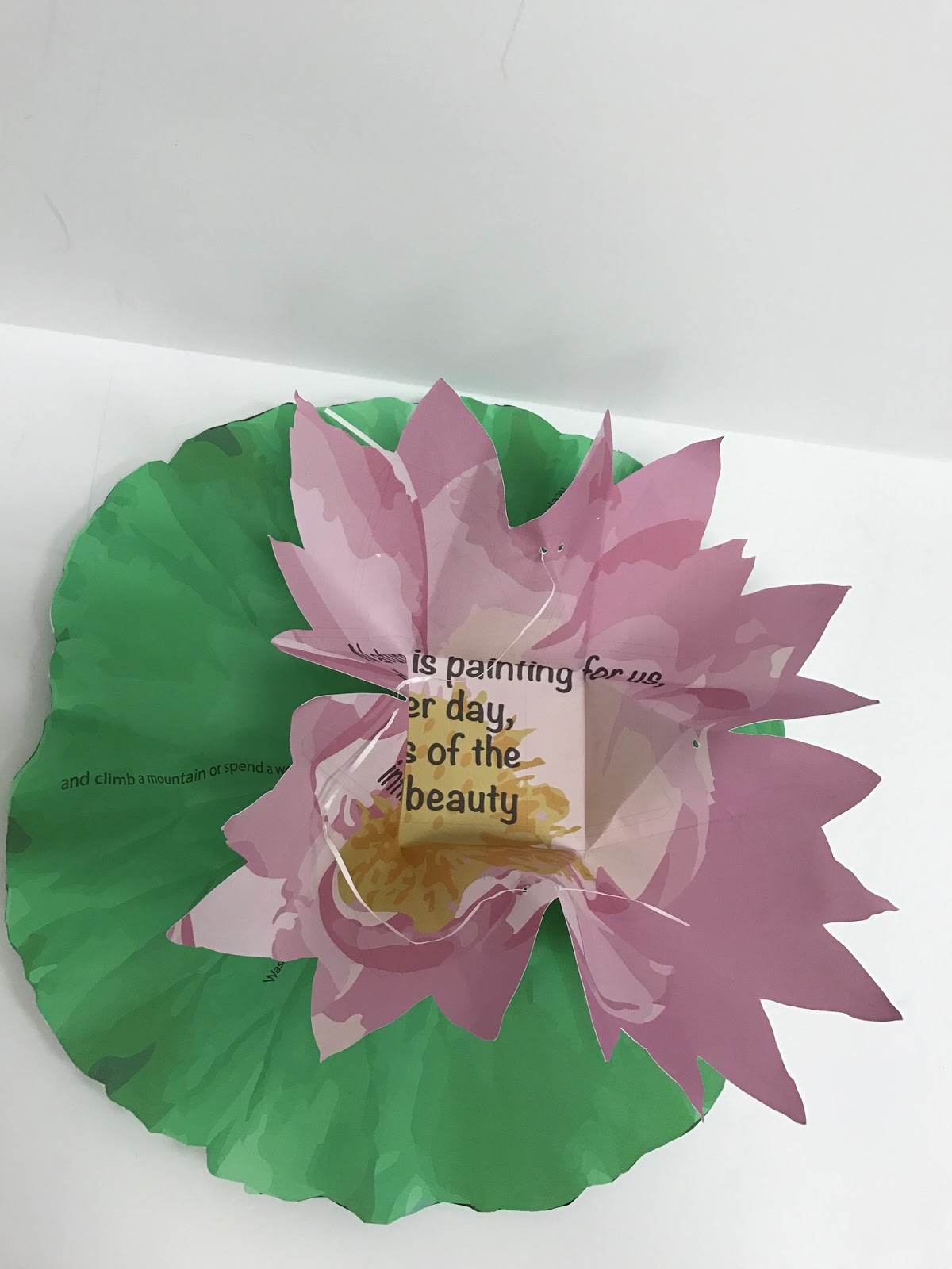
2. I put many petals on the box and make it look like a flower doesn't blossom. Audience will open the flower box and see the quote inside of the flower, and get the message about protect the environment.

3.The color scheme is complementary -Red and Green

4. The emphasis is the quote inside of the flowers.

Wednesday, May 31, 2017

Juxtapose

There are two picture, one is urban, another one is countryside. I put these pictures together because  the contrast between these two places are obviously. Color in countryside is really warm, but in city is really cold. The pattern that I used is like a cage confine the city, but outside is freedom without any pressure.

Thursday, March 23, 2017

Active

The word is 'active', so I choose to blur the word and make it become active. I made the text follow the spherical path. Also, for creating the movement of the word, I used the background to strengthen the this activity. Therefore, the word looks like it is spinning and following the spiral. The color that I used is green and yellow, because these colors represent spring day, and everything are recovered and renewed. The whole background is white because I want to keep this page as simple as possible, and it will make audience think this page is light and comfortable.


Wednesday, March 22, 2017

Loud

In this page, the color of the background and word is complementary color scheme--blue and orange. I separated each letter and throw them to everywhere in this page, but the orientation is kid of diagonal. Because I put the letter backward, and we can see through the transparent background when we are looking at this page.  Making font to 3D is more interesting, also I let size of each word become bigger and bigger from the top to bottom one.  

Stable

This page is about stable. I used black and white as the color scheme and made the gradient background to match the whole page. This word is horizontal and in the middle of the page, which make it feel steady. Using the reflection of the word can show the word is really stable above the water or mirror. Also, I used slightly difference patterns in these two words, but the top one looks full, the bottom one looks like the reflection of the top one because of the pattern, which lets audience think this word is 'stable.' 

Camouflage

I used the same color scheme to make this word hide into stripes line. Comparing to the background, the color of the word is slightly lighter, so the word will stand out. Also, I put this word in the middle of the page and horizontal. Although the pattern that I used is kind of boring, after I arranged them, the page looks balance and interesting but not inflexible. Audience can clearly know what word it is.

Friday, March 17, 2017

Wolves

This picture is about two wolves prepare to fight for each others. The initial background is snow and white, so I used the screen shot from forest and add it in this image to shows the season keeps changing over and over again. Also, I white and green represent peace.

Monday, March 13, 2017

Mapping the Designs

Butterflies and Oriental pearl tower are two main objects in this picture. The flow of dark objects, leads the eyes from darkest to brightest tone.
In this picture, the pattern of the dark starry sky leads the eyes upwards. Burj Khalifa stands in the middle of the picture with the lightest grey, which is the most brightest place.

Color-Scheme

Complementary 

Book